
An Ultra Mobile PC with a Haptic Attitude
Showcased at 100% Tokyo and designed by interaction designer Crispin Jones, this Ultra Mobile PC (UMPC) is a beautiful example of designing with a Haptic experience in mind. Let me tell you why.
Called “PCs for Poets” this product seems targeted to specific users and people who want a more personal electronic device for writing rather that the business users that UMPCs have, to date, been targeted to. A new blogging machine perhaps? Suitably, as it’s a writing product, it was partly inspired by a suzuribako or a Japanese writing box used by writers during the Edo period in Japan.
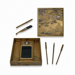
Until the end of the Edo period (AD 1868), every literate Japanese had a personal writing-box containing brushes, ink-stone, ink-stick and water-dropper. The quality of the craftsmanship reflected the status of the owner.
Source: British Museum
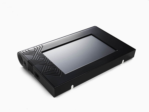
The beauty of the design actually comes from in the details of the engraving on the housing even though the overall shape is fairly generic. The grooves are definitely a cue from the engraved writing boxes. This haptic and tactile detail, tugs at a memory, thus bringing to the user a certain sense of familiarity with the product
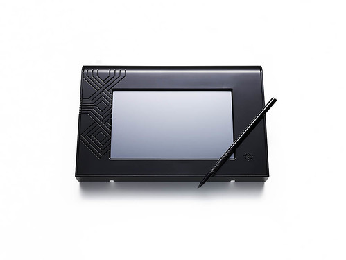
The beautiful stylus is also again an exercise in Haptic design and a really clever idea. The best part of this product if you ask me. The spongy tip makes the stylus write a lot more like a brush rather than a hard tip pen.
According to the designer, both the front and the rear of the product was given equal attention. The slightly deeper recess on the back provides a sensual pattern for the fingers as well as encouraging interaction by sparking the curiosity of the people sitting around the user.
Personally I much prefer thinner grove lines because its proportions seem too thick for the overall size of the product. But I do understand that the thickness of the lines are probably restricted to manufacturing requirements.
What I did find disappointing was the rubber feet. Its utilitarian design seems out of place with the “eye involving” lines and spirals. It would have been cool if the rubber feet could have been slotted between a grove and hidden.
The other surprising factor is that it runs on a Windows XP base. I would have love though to see the interface and the product on, especially as Crispin is an interaction designer. I’m interested in how specific the interface was designed for the writing activity.
All in all its a great product, with very minor down sides, I would probably buy it as my portable sketch pad instead of a writing pad!
Via: WMMNA, YInnovation
Design Translator
November 11, 2006 at 9:37 amHmm the texture is looking good, but yes i agree with you the thick border around the screen is really too much. The amount of plastic also makes it a little clunky, it perhaps should have some metal parts to draw the eye away.
However in reality when you hold it, it would not look so bad because its pretty small, I would say about the size and thickness of a large bible.
AEN TAN
November 11, 2006 at 3:26 amIf we could make replicas of those Edo versions and retrofit LCD touch screens in them, that’ll rock!
The lack plastic box just doesn’t cut it… it seems when you knock on it it will make a “kack! kack!” noise… LOL!!!
The best part might actually be that brush-like stylus! The primary weapon of poets should be the brush and not the box!
AEN TAN
November 10, 2006 at 3:04 amAfter looking at that Edo version, I thought it might be pretty cool. But it didn’t really have to have the same thickness.
A little too plasticky, I like more metal and more glass, the display should take up more space.
On the other hand it has a toyish twist to it so I guess it might win the hearts of those who can see beauty in it!