
Wacom Bamboo: It's all in the name?
I’ve always been a fan of drawing tablets though I have the toughest time getting my drawings right by using it. I’ve even written extensively on it, comparing the differences of sketching in a traditional sketch book, to sketching on a drawing tablet and finally on a tablet pc. Thus when the Wacom Bamboo tablet was launched, targeted to the non-graphics market such as business professionals and home users, it sparked a great interest and a little worry if it might make my very expensive Intuos3 obsolete.
Like its namesake, Bamboo is extremely versatile, unlocking powerful pen-based features found in current operating systems, especially Microsoft’s Windows Vista, for freehand writing, annotating and navigating on computers.
However i did find a disconnect with their product name and design, sparking my curiosity of the story behind its industrial design roots.

This red-dot 2007 winning concept was designed by SIGNCE (formerly Ziba Europe) and was meant as:
…to reflect a new attitude of working with a computer using a digital pen. Bamboo enables access to the enhanced functionalities of current operating systems such as handwritten input, and lets consumers easily develop their individual style of working.
Source: Official Press Release
But why the name Bamboo?
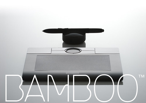
Alf Hackenberg, head of the design team at SIGNCE in cooperation with Martin Langkau, said: “The central element of Bamboo is its new round ‘Touch Ring’ for navigation located on the upper edge of the product, allowing an intuitive and ergonomic control of important commands. The additional ‘ExpressKeys’ correspond with the Touch Ring, and the stylish blue backlight to provide easy access to often used functions.”
The appearance of Bamboo impresses with contrasting high gloss finished and elegant matt surfaces and is black with illuminated keys. Black was chosen for its stylish look and to meet the aesthetic needs of both Mac and PC users.
Alf Hackenberg continues: “The high-value product aesthetics are created by the signature combination of different surface characteristics that are consequently applied to all elements of the product including the Bamboo pen, pen stand and tablet. In addition, the black colour makes the tablet appear stylish, emotional and almost mystical.”
Source: Official Press Release
Looks like Alf was not the designer as he sounds like he is struggling to explain the concept. When I first saw the name, (ie before the pictures as my email filters them out) I imagined a Chinese poet or artist sitting with his paper rolls and composing with his “Mao Pi” or Bamboo brush. I must admit to being a little shocked once I looked at the images but I can see where they are coming from in their initial concept development. Don’t get me wrong, this is a great looking product both in aesthetics and functionally, but I just cannot reconcile the name and its form or finish.
I suppose at the end of the day it might be better that a concept name should stay as just that, a concept name.
Design Translator
June 11, 2007 at 10:47 pmHi Heyuti,
Thanks for the heads up and for visiting. I will take a closer look!
Heyuti
June 11, 2007 at 12:26 pmhey take a closer look at the stylus. it took on the outline of mao bi! Noticed the profile at the end of the tip?
The side profile of the tablet gave hint of those bamboo/wooden slips that traditional chinese wrote on. Maybe i’m going too far but don’t u think the circular touch ring and it’s finish looks like an area where u “tab” your mao bi for the ink?
Design Translator
June 10, 2007 at 7:28 pmSorry for the late reply, I have been busy the last couple of days.
@Asgeir, I suppose you are right if you associate the fact that now you can write just about anywhere! Anyway please do keep in touch.
@Drew, it IS a nice logo is it not? Well I think that’s my associations as well, that very home décor application. But you are right, I myself may even get one as for a well designed product it is not too expensive.
drew kora
June 7, 2007 at 8:06 pmI see where you’re coming from DT. Pier 1 Imports and Potterybarn (homestores in the states…what do they have down under?) have ingrained bamboo into so many seasonal summer patio sets, photo frames, place mats and window coverings that it’s really hard to imagine anything other than actual bamboo when I hear the word ‘bamboo.’ I think the word carries a very home decor, natural, summery quality to it. So, I agree that there’s a disconnect between the name and product for sure.
However, I sort of agree with Asgeir. I don’t think the disconnect will keep people from buying it. I think there will be initial puzzlement about the name and then they’ll get over it. The same they did for ‘bluetooth’ and ‘blackberry.’ I think what’s sad here is the lost potential behind a product name like bamboo. That might have been a good name for the un-p3 player. : )
Regardless of the product, I really love the BAMBOO logotype. Beautiful.
Asgeir Hoem
June 7, 2007 at 4:33 pmI am not an expert at this, but “Like its namesake, Bamboo is extremely versatile (..)” sounds like a fair explanation to me. I’m not saying the name is perfect for the product; I’m just saying that I didn’t react on the disconnect you mention between the product design and the chosen name.
It is interesting though. I have never really paid attention to names this way.