
The Unconventional Ora Watch
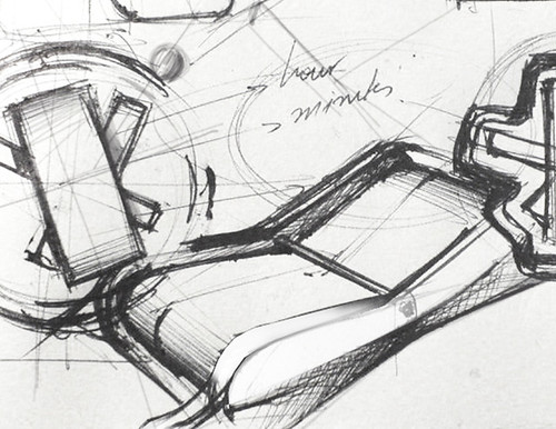
Check out Alexandros Stasinopoulos’ very cool Ora watch! What is even more exciting is that Alexandros has generously shared his concept sketches so that we are able to have a deeper insight into his thinking process.


the purpose of mechanical watches is not just to display the time. they are, and ought to be, the showcase of human achievements in the fields of engineering, aesthetics and of course craftsmanship – just to mention a few. it is essential for mechanical watches through their form and functions to reflect these values and therefore to be the mediums to push the limits and discover new territories of creation and technological advancement.
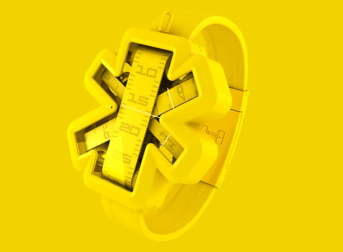
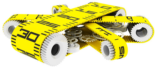
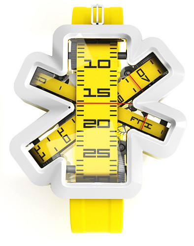
ora concept is a study on the field of haute horlogerie. it focuses on the display of time via an unconventional mode, by replacing the expected dial arrangement found in the vast majority of the mechanical watches with a set of three interwoven tapes – one to indicate the hour(s), one to indicate the minute(s), and one to indicate the day.
the arrangement of the indications derived from the aspiration to demonstrate in a bold and dramatic way the passage of time. the design of the case reflects an “inside-out” design approach as it was the mechanism’s arrangement that prescribed the overall form in an attempt to enhance its uniqueness and create a distinctive silhouette.
ora [awr-uh] : phonetically a) “hour” in greek b) in greek the imperative “look!”
It is very clear that Alexandros has strong thinking foundation that drives his concept’s uniqueness. However, I do have few thoughts in my mind that popped up after looking at his sketches and design philosophy.
I find, from the design sketches, a very strong symmetrical element to the concept. So I was surprised to see, in the final design, the slightly off angled X that, in my humble opinion, makes the design more quirky than engineered. While I don’t think it should look like an asterisk, I wonder how it would look if the X was balanced more evenly? Also from a usability and readability point of view, I believe the hour tape should actually be read from an ascending orientation rather than the descending set up it is currently in.
Regardless, as they always say, hindsight is 20/20. So these thoughts (or improvements?) are by no means intended to put down the effort Alexandros has put into the design. Well done Alexandros and do check out the rest of the Ora watch and its different colors at his personal portfolio site.
Via: Yanko Design
Rally
June 6, 2012 at 1:53 pmI was doing an assignment on product design, the sky being the limits, and I came across this. I just want one. NO I want a whole bunch of them in different colors! ! ! This site is dope and I want to learn much more. . .
DT
October 5, 2009 at 5:42 pmHi Alexandros,
Thank you for stopping by and sharing further insights of your design. Good conversation.
alexandros
October 4, 2009 at 3:38 pmDear DT,
Being a regular visitor of designsojourn (as my academic background cuts across the fields of design, product design, and marketing, product innovation management) I was pleasantly surprised to see that you have included my project in the content of your website. Thank you for posting it and I wish to compliment you for the effort you put on designsojourn as I find that your website provides food for thought for both domains (design & strategy).
As for the design of ORA in reference to your thoughts, they really point out some elements that I would also reconsider. I would like to add/note some extra things though.
It’s overall shape initally, as you correctly observed, was symmetrical. However, I moved away from this design language as I believed that in order to stress the idea behind the project I should go for a more “bold” (even extreme, if you like) form. This is how the “asterisk” look came out. Then, I went for a symmetrical “asterisk” but then again, I found it very illustrative and as a bit “boring” and “expected”. Also, I wanted to stress differently the importance of each indication (minutes/hours/day) and therefore I went for different thicknesses and and asymmetrical look.
As for the tape orientation movement you are absolutely right! 🙂
Just a bit of background information
Best,
Alexandros